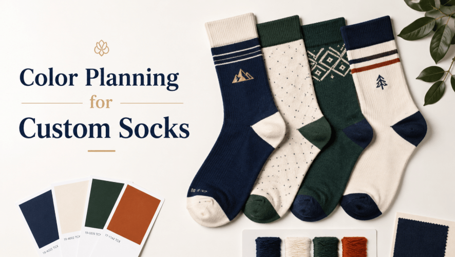
Color is one of the first things people notice on socks. For custom orders, it affects brand recognition, group identity, and how professional the final product looks. But sock color planning is not as simple as choosing colors from a screen.
Yarn colors, knitting methods, fabric texture, and stretch can all change how the design appears. Buyers should plan colors carefully before production.
Screen Colors and Yarn Colors Are Different
A color on a digital mockup may not match yarn exactly. Screens use light, while yarn uses dyed fiber. This means a bright blue, red, green, or orange may look different after knitting.
If the brand has strict color requirements, buyers should provide Pantone references or clear color standards. Even then, exact matching may depend on available yarn, dyeing options, minimum quantity, and production method.
For custom socks with logo, color planning should happen before the design is finalized, not after the mockup is approved.
Limit the Number of Main Colors
Too many colors can make a sock look busy, especially when the design uses jacquard knitting. A simple sock design may use 2–4 main colors more cleanly than a complex design with many small color changes.
For branded socks, a base color, one accent color, and one logo color often look cleaner than a design filled with competing shades.
Contrast Affects Logo Visibility
A logo needs enough contrast to be readable. Dark navy on black may look subtle, but it may disappear from a distance. White on black is clear, but it may feel too sharp for some brand styles.
Buyers should decide whether the logo should be bold or subtle. A team sock may need strong visibility. A company gift or small brand order may look better with softer contrast.
Color Placement Depends on Sock Height
Different sock heights show color differently. A no-show sock may hide most of the design inside the shoe. An ankle sock gives limited visibility. A crew sock gives more space for stripes, patterns, and logos. Knee-high socks allow larger color blocking but need careful balance.
A types of socks guide can help buyers decide which sock height gives enough visible space for the planned color design.
See also: 10 Best Backlink Services for Shopify Stores
Common Color Mistakes
One mistake is using too many brand colors at once. This can make the sock look crowded.
Another mistake is relying only on a screen mockup without checking yarn or sample colors.
A third mistake is placing the logo on a low-contrast background. Even a good logo can fail if the color contrast is weak.
Practical Checklist
Before approving colors, check:
- Are Pantone or brand color references available?
- Does the logo have enough contrast?
- Are there too many colors for the sock size?
- Will the design still look good when stretched?
- Does the color plan match the target audience?
Conclusion
Color planning can make custom socks look professional or messy. Buyers should consider yarn limitations, contrast, sock height, and the number of colors before production.
A clear color plan helps the final socks look more intentional and easier to wear.